Showing posts with label Contextual Research. Show all posts

Wednesday, 20 January 2016

DEVELOPING SAMPLES FROM MICHAEL KIDNER

Using the same ETHOS design and repeating randomly, changing the colours to experiment with composition. Stitching onto different fabrics, e.g. polyester chiffon, that can be layered over other samples to create more depth and patterns.
Instead of creating lots of different designs I wanted to explore the potential of using the machine to push the boundaries and create patterns. I flipped the designs, and rotated them matching them up on the striped denim and also purposefully stitching offset (the latter was more difficult).

Bmp. of ETHOS design.

Layering samples was effective and helped with inspiration towards to progression of further sampling ideas. Through layering samples I created a more diverse collection successfully aiming towards many contextual outcomes, layering also helped towards creating a woven fabic effect through embellishment.

Contexts to explore were fashion and interiors; mainly focusing on Menswear and Suiting, aiming at high end designers, such as; Paul Smith, Saville Row and Hawes and Curtis. Sophistication is created through the restriction of only eight colours and the repetitive element of simple designs found within the stripes. My samples aim towards outerwear, suiting, fabric linings etc.


Tuesday, 12 January 2016

TUTORIAL & EXPLORATIONS

After discussing my Michael Kidner work in my tutorial, it was decided to carry on progessing with samples and using my self initated project to develop my work and experiment with techniques to push contextual boundaries.

Using Paul Smith as a contextual influence as his designs are manipulated into many different products, from cars, to bottled water. The versatility in the stripe designs allows his work to appeal to a wider audience. Some of his designs feature quite natural colours, greys and browns - this helps to calm down the colour in his work for a less intense effect.
Paul Smith - Original Stripe Design (Material)


Continuing with the use of stripes in my own samples, I will further experiment with weights of thread onto printed bases. Using Ombre threads to create a hand-made persona, and exploring set stitches on the Pfaff machine to quickly stitch a simple pattern.  Again experimenting with materials, I will use lightweight and heavy weight fabrics to viualise context, changing the texture and thickness of threads to experiment with the optical effect.

Also experimenting with the scale of my own stitches on the Ethos Software, ever changing the composition to sitch a textural fabric with an all over embroidered pattern, that depending on the material choice, could become double sided.

Thursday, 10 December 2015

PRESENTATION FEEDBACK & VISUALISATIONS

Gathering feedback from my presentation,  I decided to aim for a product to sample towards within interiors. For me this was a bespoke armchair. Creating initial design ideas helped to progess with placement of embroidery and the depth of layering, choosing sterdy materials like cotton canvas as an upholstery material.


Artists such as Collier Campbell were suggested for me to explore as my own work is similar and could help towards reviving the Campbell company. I also explored the work of Jennifer Taylor, her interior furniture designs are classical and contemporary all at the same time, aspiring to this I created my own designs combining the market research I found and the high end quality that I aspire to. 


It was also suggested to keep the simple stripes and checks as a base pattern, using embroidery to add the detail and texture. The experimentation would be within the scale, composition and choice of machine and stitch. I further want to explore layering my embroidery designs more, creating a sample that is more dense in some places than others.
I have also this week experimented with weight of material, using a 'Cotton Organza', to help me visulaise a double sided sample, due to the transparency of the fabric - this also opened my eyes into fashion fabrics. 


Thursday, 3 December 2015

DEVELOPMENTS

Further developing drawings into collages and repeat prints, explored a varied surface for me to work with, and processing these prints into digital fabric and experimenting with transfer printing successfully enabled me to produce optical illusions when embroidered ontop of.


Producing illusional drawings from gouache and acetate to allow layering helped to develop my ideas into stitch techniques. A restrictive colour palette of eight colours entailed using technique and skills to create a more versitile reponse to optical illusions meaning the restriction of colour made the chance of illusion higher.

Inspiration for all of this came from Wallace & Sewell and Japanese Op Art.
Wallace & Sewell design woven poducts, for interiors and fashion, using their construct techniques as inspiration to produce my drawings and adding the stitch to enable my fabric to connote woven materials.
Japanese Optical Art inspired the circles and how to fill them with stitch, using spirals with a varied stitch length and changing the direction of the stitch fill, using a shiny madeira thread enhanced the illusions.

My samples are mainly being produced on the ETHOS software as it easily translates my ideas into optical illusions. Creating my own stitches on the software allowed me to reduce and enlarge; the pitch size, the 'packing' stitch, composition, scale and layering. This software has allowed me to produce effective samples quickly as ideas can easily be manipulated.


Thursday, 26 November 2015

SAMPLES

With the aim of working towards three collections of samples that make up one final collection, I decided to explore Spots, Stripes and Checks. Investigating into how composition determines the effectiveness of the sample, and how to combine the correct patterns.

Combining the patterns (eg, spots with stripes) was successful as the designs became more intricate and planned.
Carefully planning the placement of the spots on top of the print, by aligning the colours - was even more effective as the optical effect was greater and allowed the spots to dance on top of the print.  Therefore the movement and structure of the print onto the surface was successful in keeping with my main influence of Michael Kidner, using space as a constant movement.


Using Japanese Optical art as an influence helped to progress my initial thoughts and push the boundaries even further by thinking outside the box, inspiring me to challenge myself in creating something similar with colours. Aiming to create stitches on the Ethos sewing machine that are similar to those of Japanese Optical art will be a challenge, however the restrictions of the machine should enable a more effective and repetitive outcome.
Experimenting making my own stitches on ETHOS software.

Monday, 2 November 2015

DRAWING DEVELOPMENT

Due to the research that I have already produced into my practice work, I feel that the Michael Kidner brief best fits my aspirations as a live project.

Kidner uses the concept that "Space is a constant movement", keeping with the ideal of beauty and how it can be translated through movement and the use of stitch I want to further explore how colour combinations and an optical effect can be created by colour choice and placement.

Strips is a series by Gerhard Richter, examining his previous paintings and condensing them into stripes. I processed my yarn wrappings in a similar way on Illustrator to create an optical effect. Effectively these drawings could be digitally printed and further embroidered into using domestic techniques to optify.


Monday, 26 October 2015

BRADFORD PRESENTATION: FEEDBACK

Feedback from the Bradford presentation was crucial to help me with the developments of my practice work and research.

After displaying my samples and explaining my concpet of 'Ideals of Beauty', and creating a surface with personlity and movement using stitch techniques, it was suggested to me that I explore construct techniques. With connotations of Knit and Weave, my samples consist of linear structures and exploration of colour through yarn wrappings. I will aim to develop colour mixing through the use of print and threads, experminenting with printing techniques and successful layering of embroidery. 
Another technique to consider is 'Floating', this is a more dense technique for colour mixing threads.

Missoni | Rosita Missoni: designer | Husky 100 plaid throw | Wool | Deflected double weave | Italy | 2013 

Anne Wilson 'Walk the Warp' was suggested to me to explore "...referencing hand-woven West African cloth and commercially woven French beach stripes.". Taking inspiration from this, aspiring to combine weave processes to create embroidery samples; creating a warp with threads that won't work on the domestic Bernina and colour mixing on a hank, making it easier to lay threads down creating a surface that connotes yarn wrappings.
Anne Wilson 'Walk the Warp', Houston, 2010


Monday, 12 October 2015

INITIAL SAMPLING

Using the keywords, 'beautiful' and 'movement', I produced a sample inspired by my summer placement at Cabbages & Nettles - this consisted of thread covering a dissolvable surface. The sample technique was successful as it created a flimsy structure, movement and personality.
However I would choose next time to take colour inspiration from my yarn wrappings and stitch/couch threads in a linear composition - as steering away from tree bark, and trying not to replicate the colour compositions will allow progression.

First Sample: Free Stitch onto Dissolvable

The digital prints that I produced (inspired by Marit Fujiwara) needed to be broken up to conform a constructive surface. After understanding my photographs and trying to translate them into stitch I decided to cut my prints into thin strips (connoting yarn wraps), I trapped these vertically leaving small gaps between each, inbetween two pieces of dissolvable material before stitching constructive embroidery across to hold the material in place (this was influenced by patterns found in knit and weave techniques).

Using construct patterns I used my colour mixing skills on a domestic sewing machine to produce a sample with movement.
To make this more effective, I will colour mix threads more specifically to eliminate a definate transition between colours (this will include changing tensions, and spool colours)  - the digitally printed material strips will have to be thinner to allow a more delicate movement.

Monday, 5 October 2015

DRAWING DEVELOPMENT

Initially inspired by Ashley Goldberg and Jackson Pollock, meant that I produced textured drawings using layers of acrylic paint onto pre prepared surfaces. The drawings didn't contain enough depth, it would be more effective to produce 'beautiful' collages, to represent the decay and broken colours. To do this I deconstructed and rearranged drawings, to influence embroidery techniques.  
Collage from previous drawings.
During tutorial it was discussed that my practice, is representative of constructive embroidery. Due to this my research developed into fabric manipulation and working with dissolvable materials to create my own fabric. I explored the artist Marit Fujiwara, she uses threads to draw onto materials, creating interesting surfaces with movement that develop their own personality.
Understanding that drawings should come after sampling for me has been a massive development this week, discovering that I can use fabrics and threads to draw with. Drawings should be of samples to help reproduce ideas.

Marit Fujiwara - Wedding Dress

Monday, 28 September 2015

SUMMER REFLECTION


Reflecting on Summer work I realised choosing a context is better decided at the end of a project - this has taken me away from Children's clothing, which was restrictive. I am now forcing myself to read my own research to professionalise and contextualise my textiles samples.

Retracing back through my research of un-appreciated beauty, to my photographs of tree bark, and noticing the decay and colours. I decided to spend the week producing various yarn wrappings from carefully selected threads to extract the colours and textures.

 
Tree Bark & Yarn Wrap (Colour/Texture exploration)


Late this week I visited the Jackson Pollock exhibition, at the TATE Liverpool, to help influence my drawings. This was a real insight into colour combinations and how texture can be created through layers of paint. I began to understand how painting can bond a relationship with the viewer, and that beauty is everywhere - lost or found. 


Number 13, 1952:  Oil on Canvas

Thursday, 27 August 2015

CABBAGES & NETTLES: WORK PLACEMENT

Rachel Nettles qualified in Fine Art Sculpture BA (Hons) at Wolverhampton Polytechnic (1987-90), having previously studied Art Foundation at Manchester Polytechnic (1986-1987). Here her work consisted of women made from tights, attached to life sized three dimensional textiles instillation's (Bicycles, Lawnmowers). From there she worked in various places, working in props and sculpting for television with company Minister Models (1990-1997). She then began work with Habitat before creating her own company Cabbages and Nettles (2013-Present).

Copyright: Rachel Nettles
Cabbages & Nettles was created in 2013, and is a small business based in Altrincham, Manchester. 
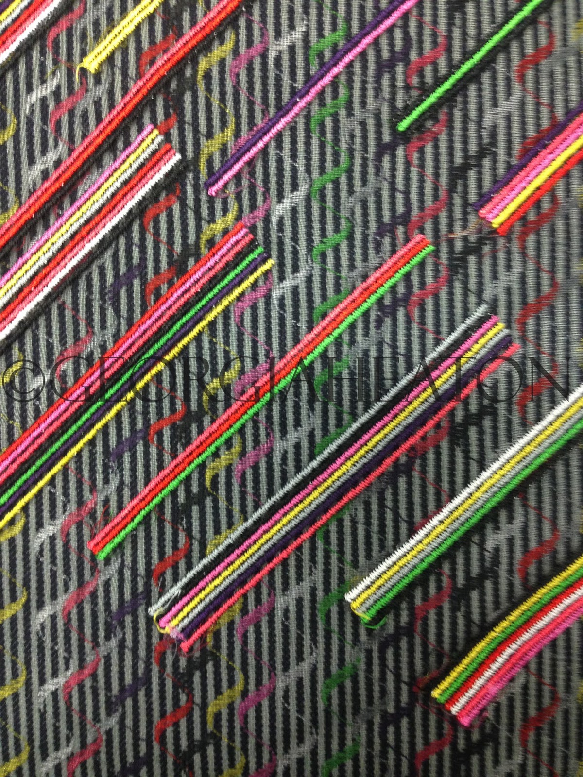
The work produced here comes in the textile form of vegetables and floral arrangements, everything is created using only free machine stitch and water soluble material. 
Using organic forms as inspiration, Rachel decomposes vegetables to create templates to stitch before constructing.


 Gathering various types and colours of thread is just the start to the long process of creating the three dimensional textiles pieces. Rachel draws around the template onto water soluble material, and then changing the top and bobbin tensions, uses the different threads in the machine to layer (almost like colouring in with a sewing machine), when the whole of the template is covered in tonal colours of thread, the soluble material is washed away and left at the end is a material made from thread that can be shaped into decomposing forms whilst drying (ie, crinkled leaf). These pieces are then all constructed and stitched together by hand to make the final product. 
The organic theme to Rachel's work is truly inspiring, the creative inspirations and influences that her work is derived from, truly does express her interest in the arts, which further develops her own influence into the art world.

Copyright: Rachel Nettles
Working over summer with Rachel, for her company Cabbages & Nettles was a real eye-opener into running and starting a business, and the importance of networking and building rapport with customers. 

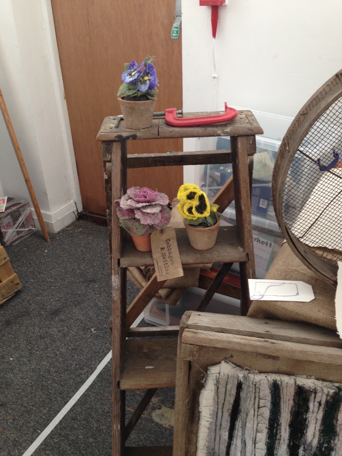
Over summer I was given the job of stitching leaves and bodies for various vegtables that would be part of the installation at the Dig The City event in Albert Square, Manchester. This was challenging as although I myself am influenced by nature, I had to adapt to a different way of working, in comparison to my own work, the work at Cabbages & Nettles is very lifelike, rustic, loose and free.


Cabbages & Nettles Studio (Event Preperation)


I have come to understand what it takes to run a business, the hours that Rachel works and the never-ending networking and craft events that are attended. The projects and events that Cabbages & Nettles feature at all coincide, which allows little room for mainpulation with deadlines, adding un desired pressure. And Rachel does this all on her own! (with help sometimes from students, like me!)
The work of Cabbages and Nettles has featured in the Craft & Design Magazine September/October 2015. 

All in all I found the work that Cabbages & Nettles produces to be something to be proud to be part of. 
I found that Rachel is a true inspiration and her work has influenced me to push boundaries and to keep following your creative dreams, because hard work really does pay off! 

Copyright: Rachel Nettles

https://uk.pinterest.com/rnettles68/
https://www.facebook.com/cabbagesandnettles?fref=ts


Friday, 1 May 2015

Investigations

Drawings that I produced influenced by Ashley Goldberg weren't successful and reflective enough of the Whitworth and what I aspired to achieve. Therefore I decided to scan these images into Photoshop and colour match my colour palettes to the compositional drawings. However, these drawings weren't vibrant enough so I decided to develop on technique - changing the medium used to draw with. 

David Hockeny was the main influence for this. I allowed myself to research into the ever changing medium within his work. Starting off using acrylic, oil paints and gouache, and developing into the modern day using an 'app' on his iphone called "Brushes". Hockey uses the app to paint landscape art using colours that he notices directly (even though this might not be the exact colour), he paints as he first visions it, and this was a massive help to me as it enabled me to start to visualise different colours in the initial photographs and create developed drawings using more vibrant colours - this reflected my Whitworth target audience more effectively.
These drawings were taken from the "outside, inside" theme, capturing the outside colours of my (tree) photographs, with the inside patterns. 

 
After producing these drawings I decided after seeing students work from 3D and their miquette's in the peer review, that it was time for me to understand my product more by concentrating on the construction of it. In particular how easy it is to make (for production purposes).


The bird (keyring) will be digitally printed, and the outline will be satin stitched using the domestic Bernina. This is to ensure that every bird is the same until the construction process where it will be hand sewn by the consumer to allow each bird to be unique, making it more personal.

Sampling started with digitally printing various drawings onto 100% white cotton.
The first set of samples that I produced were embroidered onto using the Cornelly, as I found that the continuous movement of the machine and thread would allow me to draw the spiral patterns on the inside of a tree. The chain stitch the Cornelly machine produces vaguely represents that the Whitworth gallery links the various communities around the area together. 


After producing these samples I found it hard to visualise them as a 3D product, so I made a window frame of the exact template measurements to focus on the important parts of the samples.


I decided to produce further prints after sampling various techniques onto my inital developed drawings, as the embroidery wasn't effective enough.
I haven’t been completely happy with previous drawings and I came to the conclusion that when the photographs are layered with the drawings, they are very strong and distract from the main focus in samples. Therefore I have experimented with the opacity of my photographs, layering them with these developed drawings and stitching into them using various carefully considered techniques. I started changing the opacity of drawings and pixelating them on Photoshop allowed me to embroider easier as I could focus on techniques better. 


Thursday, 2 April 2015

Research

I started this unit with a group visit to the Whitworth gallery, where the theme of bringing the "outside, inside" became an initial starting point for research. This theme became more apparent throughout the day, from the 'Welly Walk', to the Gift Shop talk, and the tour around the gallery, everything was about creating links between the outside and the inside. 
Initially I started by taking photographs of the Whitworth park, capturing surfaces, textures and colours. 
My research always starts with nature, as I believe in encapsulating and revealing beauty in unusual places that are un-noticed and often ignored. 
I also believe in keeping the clients requirements in mind, therefore making this product as personal to the gallery as possible is my main focus, reflecting upon the words "playful, intelligent and personal".


I refined my photographs to be left with three that all contained very different yet effective colour pallets.
The first artist that I research was Michael Chase, I enjoyed the blocks of vibrant colors in his work, juxtaposing against the intriguing textures of his digital photography. Therefore I started to digitally layer colours found in my photographs using the eyedropper tool with the photograph the colour was taken from. 


 These initial photographs as a starting point all escalated from the renovation of the new gallery, the juxtaposition between the old and the new allowed my research and drawings to contrast against each other. Looking outside into the park I found detail, but looking back into the park it was very clinical and basic.  
 From my colour developments I made yarn wrappings and colour blocks to help define materials and threads to use when ready for sampling. Samples will all be made with everything 100% cotton, influenced by the Manchester cottonopolis era occuring around the same time the Whitworth became an institute, which led to it becoming a textiles based gallery. 


Reflecting upon previous projects, my strengths lie within designing towards fashion and accessories, and after researching the Whitworth gift shops I found myself working towards the cheaper of the two shops with a "buy now, think later" attitude. Aiming my designs at the target audience of families with children. 
After artist research exploring Ashley Goldberg and Emily Rickard, I decided to make a range of products with unisex colour palettes. I created drawings based on composition, influenced by both artists, using colours from the images above. 


 The 'Post-it Review' session opened my mind as I hadn't yet started to sample designs or create visualisations, which created obstacles as peers didn't understand my concept or product ideas. 
Comments from this orientated around my successful colour palettes and effective digital prints. Developing upon comments from this I will start to digitally combine drawings and photographs, to be processed again into digital prints that can be embroidered onto.
I also made visualisations of my product design ideas - choosing the 'DIY Bird Keyring' to develop on, as it had the most reflective concept of the Whitworth and the brief.