Showing posts with label L5 - Locating: Apron and Self. Show all posts

Sunday, 22 February 2015

Locating: Final Evaluation

Starting with the live brief, for me this was the Apron project: I began by re-visiting the Downing Archive, thoroughly analysing photographs taken there. This developed a vast amount of initial research and ideas to develop from, combining this with the assessment comments from the Intentions unit I decided to outline the aims of this project other than those stated in the brief. This included;
 - Samples becoming too similar due to the restrictions of chosen techniques.
 - Exploring colour and scale more.
The strengths of my work that were reviewed and highlighted were the layering of techniques and fabrics and combining hand and machine techniques.
The outline of the Apron project was to produce an Apron to develop both making and design skills. We were told to think outside the box.
Therefore after research at Platt Hall expanding understanding of Aprons, their uses and backgrounds, I decided to combine all of my research: taking forward the drawings I did of ribbons and trimmings and the Apron from Platt Hall which was embellished with various embroidered ribbons and trimmings.
Downing Archive - Drawings.

Platt Hall - Apron.
The concept for this project was again taken forward from the Downing Archive, the samples that I initially drew from were Japanese, therefore I researched into Japanese fashions and garments for help in locating my function for the Apron - the most occurent garment was the Kimono, in particular the heavily embellished and decoratively patterned ones. This helped to make the decision into making an Apron that was decorative, but using practical materials. It was aimed at a young adult age range using contextual references from fashion brands like All Saints (the Apron was to be a simple a-line skirt shape like the style of All Saints).
I started sampling by choosing materials similar to the textures in my images, these were all diffrernt tones of pink (that were found in my drawings) this included; satin, silk, velvet, chiffon and cottons. The shapes of my samples were similar to ribbons, just varying the width for help with compositional elements. I decided to use the cornelly to create a base onto my materials before beading and hand stitching to embellish and create a more textured surface.
Concentrating on the 'patchwork and trimming' element of my designs, I explored the Japanese technique of BORO, where materials are re-used, layered and constructed into another garment with the aid of hand stitch. From this I created a collage to help visualise the outcome before sampling. However I still needed more inspiration for the embellishment part, which is when I found the art of Kintsugi - fixing broken things with gold to aggrandise them and to make them more beautiful. Which is when I discovered the artist Junko Oki he uses embellishments on the edges and seams of materials to fix them together.
After sampling, focusing on compositional elements and research I constructed my Apron, however although I enjoyed creating this and beading onto materials, when evaluating it myself in the pin-up sessions I'm once again lacking in colour exploration.


Therefore when I started with initial ideas for the Self-Initiated brief I decided I was going to focus on colour and texture, which involved material and thread choices.
Instead of collating new research and finding a definite starting point I wanted to again use previous images from the Downing archive. Choosing my favourite image to analyse and question myself with what attracted me to the image.
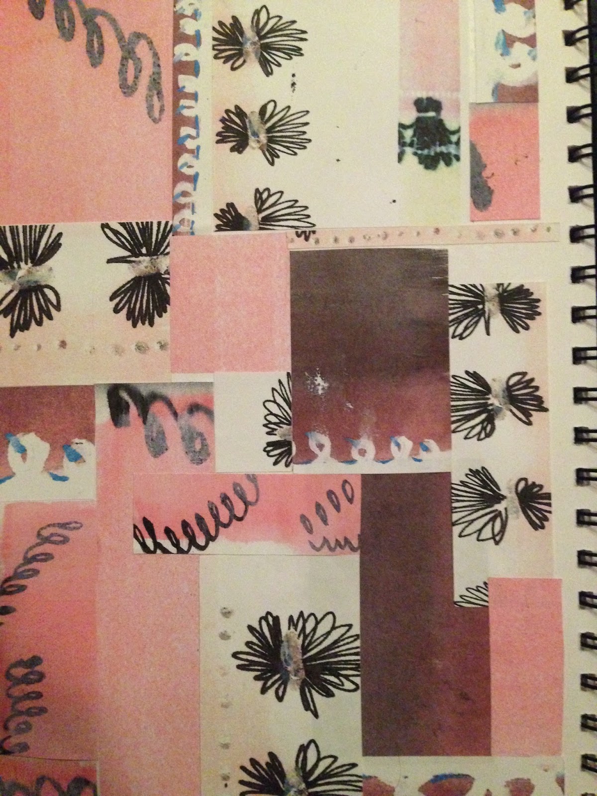
Sample book cover.
The texture and different metallic colours within this book cover had a certain depth to it which I wanted to recreate through 'drawing' and layering ideas. Using lateral thinking I started to 'draw' from distressed and layered ribbons.
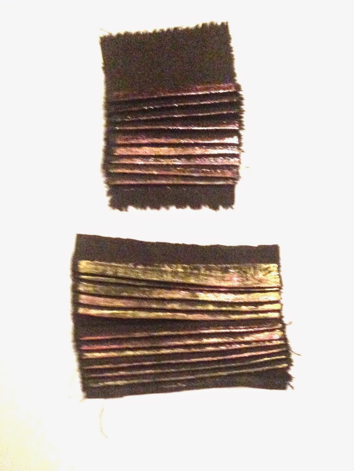
I started with colour blocking and yarn choices, creating yarn wraps by combining different threads to replicate the tonal ranges. These colours were somewhat iridescent, for me to achieve the visual ideas in my head I started to apply colour to material. I did this by selecting various coloured foils to bond-a-web and distress onto pleated linen material.
Pleating linen, layering foils with bond-a-web, distressing with sand paper and repeting the process.

After making some constructive surfaces I want to next explore constructive embroidery and fabric manipulation to further work into, steering away from embellishments for now.
My only regret for this project was bad time management and how long I left myself to complete it, however, I wouldn't be producing work and locating myself as a designer without having produced the Apron project first. The Intentions unit feedback helped me to develop the Apron project and then both helped with the Self-Initiated in the respect that colour was a big obstacle for me and I feel that the Locating unit has definitely helped develop that. 
Even after the few samples that I have produced I have different techniques in mind to produce future samples; reverse applique, kantha embroidery, quilting etc.
I would also like to further research into the iridescence of butterfly wings and the colours and textures through this, which would hopefully help locate my practice a bit further than a textiles designer for both fashion and interiors. 

Friday, 20 February 2015

Locating: Final Week

This week I have concentrated on mixing a colour palette and to help do this I have carefully selected and colour matched yarns and threads with different textures to develop on my chosen image. Some of the yarns were doubled up to create different tones and mixture of textures.

Sketchbook.
 From this I bought 'raffia' threads to paint and use in further drawings. I chose black Linen as an initial base material to start producing some samples as the darkness in the material its structured with a definite warp and weft, I then bought various colours of metallic foils to layer over this once the material had been pleated (to create the linear structure).
Pleating linen and using bond-a-web to layer gold and copper foils.

Pleating linen and using bond-a-web to layer foils (aubergine, pale pink, matt gold, copper), taking colour away to tone down the metallic using sandpaper.
These samples were effective with the choices of colour and textures which were all decided from the development I have had within my sketchbook drawing. This to me is a huge development on previous projects, including the Apron brief as I am slowly learning how to correctly produce colour based drawing/samples - this was the whole aim for me within this project, and even from the work that I have started I can see a bigger and more skillful project developing from this.
The iridescence within these images has led me to want to start researching butterfly wings, however I haven't managed time as well as I hoped and won't be able to do this before the deadline.

This pushed me towards developing lateral thinking, I decided to expand on research into archive material I already had. I started to explore woven ribbons, as the layering and distressed textures from ageing inspired me more towards developing colour palettes which would allow me to think about producing different samples from this as a constant anomaly in my work is the colour pink. To do this I used a view finder to layer over images and create small yarn wrappings.


Selection of colours using a view finder.

Using a view finder to make tonal yarn wraps.

Friday, 13 February 2015

Self-Initiated

Before this weeks pin-up session I was really struggling to develop ideas for the Self-initiated project. However after thorough analysis over my previous project and discussion with tutors, I have decided to run with my idea of strengthening my use of colour, material and thread selection both in my sketchboook and possibly through samples. To do this I am going to produce a 'drawing' based brief, still using influences from the Downing Archive.
I decided that I wanted to explore other artists and designers to see how they interpret colour within their work, this became a struggle as I began to appriciate the concept of their work but the way these artists expressed colour didn't excite me:
 The concept of Emily Notman's work is inspiring and similar to the strengths that have become apparent to me in my own work - "I find beauty in flaky walls, overgrown buildings and encrusted surfaces; this is something I recreate in my work. My pieces evolve and grow with time, incorporate history with layering and sometimes the tiniest mark made or stitch changes a piece dramatically - it’s this detail that excites me".  
 The colours in Elizabeth Terhune's work are musky, muted tones that were created using watercolours to allow the colours to run through layers of mark making. (this also follows on with the Japanese concept from the Dowing archive, as the 'wet' colour and opacity replicates the techniques they use).

Elizabeth Terhune - drawing inspiration.
However after this research I decided to colour block images from the Downing archive, choosing my favourite to start with - I chose this images because of the layering of different textures, the tonal qualities within the metallic colour pallett and the negative shapes.


Friday, 6 February 2015

Apron & Self-initiated

The construction of the final touches for my Apron threw a few obstacles as I originally set out to use the Insertion or Pfaff machine to join materials together. However, due to the heavy embellishments my samples wouldn't go through the machine. This will definitely not be a mistake I make twice as in the future, I will consider the size and construction of samples when designing, but before making a final product. Instead of Insertion and Pfaff, I used the zipper foot and patched samples together using the domestic Bernina. This meant some of the thinner ribbon strips had to be attached using bond-a-web, which wasn't ideal as due to the syntheticity of some materials and the delicate beading it was quite difficult to iron.
In the end I bagged out my patchwork fabric with the same pale pink cotton as my Apron base. To attach it to my Apron I top-stitched around the edges.

close-up of bound buttonhole as a pocket and top-stitched patchwork trim.

Ribbon tie fastening, around waist.

Finished Apron (Front)
FInished Apron (Back), with cross over ties.
After finishing my Apron I decided to start developing ideas for my self-initiated project brief. I wanted to take inspiration from the Apron brief in the sense that I struggle applying colour into fabric and threads as samples - I want to use my self-initiated project to locate myself as a designer, with the way I use colour and the processes I go through to find an end outcome. Hopefully the selection of materials and threads will come more naturally to me after exploring colours and textures within archive photographs. This project is to basically help me to develop my work for developments in future projects.

Friday, 30 January 2015

Paris, Florence & Refining samples

After producing samples in previous weeks linking to the Platt Hall Apron with ribbons and trimmings I have decided to concentrate on composition, to do this I drew up design ideas.


These designs allowed me to visualise different outcomes and percentage of different tonal colour ways on the Apron. In the end, before deciding on a final design I took my most successful samples and lay them flat to decide on a definite arrangement.


Looking over the Apron brief helped to refine design ideas as I picked two techniques from both the 'necessities' and the 'curiosities' lists. I chose ribbon ties (fastening) - which were made as a rouleux strips and pressed flat, a pocket/bound buttonhole pocket, and a mitred corner. I made a toile to figure out measurements and how long/wide I definitely wanted it to be. The main inspiration for the style of my Apron came from contextual research; All Saints (skirts), they have a signature style for their embellished skirts, just a simple A-line mini skirt with hand embellishments all over. However, I adapted this to my own needs - the 'skirt' style Apron will be backless to allow for adjustments around the waist depending on the wearer and only half of the apron being embroidered and embellished - which was inspired by the attention to composition in the Aprons from Platt Hall, this also helped with the limited time scale.


At the beginning of this week I visited an interior art fair in Paris, Maison et Object. During this project I have mainly focused on 'Locating' my work and so far have refined it down to decorative/embellished fabric surfaces that could be momentarily be taken into fashion. However, this fair has taught me that I can still produce fabric surfaces for interiors just by slightly adapting and changing compositions, pattern and weight of fabrics (even the style of sewing and adapting techniques, eg. hand stitch into machine stitch for more practicality).


Towards the middle of this week I started  to make my Apron. I got as far as constructing the base, making the rouleux ties and adding a buttonhole pocket which left me to attach my final patchwork samples.
However, on Thursday I travelled to Florence to Pitti Filati (yarn fair). This also included some trend forecasting, the most inspirational part of this fair for me was the embroidered sample layouts.


This allowed me to visualise what I could do in the future to improve my context, as I would prefer to create and design fabric swatches that can be transferred to other companies and designers that could develop them into a sell able product for Fashion and Interiors. I want to eventually be skillfull enough to be able to instantly adapt my ideas to fit a client brief, using colours successfully with fabric.

Friday, 23 January 2015

Artist Inspiration & Development of ideas

This week I have mainly concentrated on my drawings and how to translate them into samples with "patchwork" advice given. I previously drew up A3 drawings where I dissected drawings to simplify them. This really helped to decide on a colour pallet and tonal ranges. The density of colour also aided the selection of initial fabric choices.

Combining these two ideas together along with the previous Japanese theme found within the drawings I have used from the Downing Archive, I started to research and explore Japanese patchwork techniques and decided to use "Boro" which was an exhibition I went to. The artists use denim, patching together used and worn pieces of garments and then hand-stitch them together.


I created further "drawings" from this by photocopying initial drawings and playing with the scales and sizes, then cutting into strips/blocks (like the inspiration from Platt Hall with the Apron using ribbons etc.). I collaged this altogether overlapping some photocopies, like the "Boro" technique. Part of the concept for this project has been taken forward from the "Intentions" project using the Japanese technique of Kintsugi (fixing broken things with gold to aggrandise the 'uglyness' into something more beautiful), but instead I want to include embellishments to 'fix' and aggrandise the fabrics.


I decided to research artists that use embellishments and came across Junko Oki who was very fitting to my project ideas. He uses similar materials to "Boro" but includes colour and joins his work together with decorative stitches.

All the ideas I have for embellishments helped me with the ideas for my self initiated brief. I want to take forward my "Intentions" project and develop on it by adding embellishments and further detail using hand embroidery, I want to develop on the critique and grades I was given.

Friday, 16 January 2015

Sampling & Context

This week I have taken all ideas and decided to start sampling to help visualise the effectiveness. I have used mainly heavyweight materials varying the thread densities from the line qualities in my drawings and photographs. The most effective of my first week sampling were the fine 'Cornelly' and 'Frank' designs as the stitches were delicate and can be layered, however for what I want to achieve I'm going to try this onto lighterweight materials (eg. silks, chiffon/organza), with possible dainty layers of beading.


My tutorial this week allowed me to open up and thoroughly visualise my own work with the opinions of everyone else in my group. This had triggered new ideas and opportunities. I have decided to change my materials as previously stated because I feel they will work better towards my style, which has further helped me to locate my work into decorative embroidery and embellishments - for both Fashion and Interiors (but in this case it will be Fashion).
I further researched this finding embellished clothing design and what I noticed the most was how capacious the designs can be which mainly led me to think about composition more.
I struggled to produce samples with compact patterns, so I related back to my most helpful way of designing which is tracing paper drawings. I process these through the printer to create patterns. The outcome of this concluded with me producing machine embroidered samples on the cornelly to create a base on my fabric and then layering with beading and embroidery. I decided on these ideas using research with Fashion inspiration from clothing brands like...
All Saints
I also took inspiration from...
Ellie Saab
Dolce & Gabanna
Taking ideas of using various tones of one colour and pushing this to get the best out of sampling.

Using the tones of a singular colour as inspiration.

Friday, 19 December 2014

Initial Ideas

One "Apron" in particular from Platt Hall was the 1870-1890's style, made from black silk, with a small bib and decorated with ribbons and metal threads. It includes a slightly pointed off centred pocket, the fastening is a similar construction to a rouleux loop. This "Apron" content and concept is similar to what I want to produce as I will be using drawings from the "Downing Archive" in particular the ribbons and trimming drawings.


From this archive material I decided to draw up some initial design ideas and compositions of "Aprons" to help with sample ideas and shapes.
My original drawings needed to be developed so that they furthered ideas and fit the concept easier, therefore I decomposed them into colour and simple linear shapes and further patterns.


Looking over my previous tutorial and the advice given to follow the ideas of ribbons and trimmings, it was suggested to me to look at Korean patchwork techniques to join future samples together. However I didn't find that this was fitting into my style of working, along with my initial ideas but I will keep this technique in mind for future reference.

Friday, 12 December 2014

Unit Launch & Tutorial

The Locating unit provides the opportunity to develop an understanding of your own contextual practice, which for me will be a great help as I have previously been struggling with "Locating" my work, and have been testing different areas to discover where my work is at.
After thoroughly reading over the live project briefs, I am aiming for the "Apron" project as it provides various contextual opportunities within the 'fashion' areas, theres decorative and practical. Within these there is an opportunity to discover the styles of different aprons dependent on the wearer. Both the decorative and the practical category generally highlights the social status or rank.
The visit to Platt Hall was very helpful as there were different styles, compositions and decorative qualities depending on where the garment was made and which era it originates from. Reading over the Apron descriptions was interesting as it teaches you the sentimental qualities and the purpose of the "Apron", depending again on the decorative qualities and the skill involved, along with the style (those with a full design and little embroidered detail with full stable fastenings or ties were generally for more practical uses, as they weren't as delicate).
From this visit the "Aprons" that interested me the most were the more embroidered and embellished designs. There were a few with this style, all of those that caught my eye were originating back to the 19th century - all of the same era.
The first was 1850-1860, made with black velvet, trimmed with black lace and embroidered with a carefully compositioned colourful floral design. This was a skirt apron with a bib attached, and no back, its fastening was a ribbon tie.


The second originated from 1860-1870, this could be seen as a development from the first as in replacement for the lace trimming was beaded fringing, and for structure, two pleats running down either side of the centre. It was again made from black silk with a carefully compositioned floral embroidered design and ribbon ties.

The main inspirations im taking from this was ribbons and trimmings from the 19th century with an apron shape of a simple skirt design with no back and ties.
My tutorial this week helped me to understand my colour pallet, due to struggling with the experimentation and matching of colour within projects and this being a major weakness in my last project, I really needed to organise colour before any samples were to be started/designed. Looking over drawings that I wish to use from the "Downing Archive", the range of colour was quite restricted, being mainly tones of pink, this is a challenge for me to utilize the lightest and darkest colours and to match them together successfully and effectively.