Throughout this unit I have thoroughly challenged myself exploring processes
and building upon new skills to effectively construct samples towards a successful
final outcome. Developing my own structure to working and producing
varied outcomes through the restrictions within my research enabled me to find
a process in which I work best. Firstly this included sampling and then later
visualisations and designs of samples through drawings, becoming inspired by my
own work.
Starting the Practice unit with inspiration from my Summer project
and influences from my placement at Cabbages & Nettles I was aiming
towards a body of work that concentrated on surface embroidery, using stitch
techniques to materialise layering of thread through the use of a domestic Bernina.
Initially researching tree bark with the concept of 'un-appreciated
beauty' meant my colour palette wasn't very clean and contemporary.
Searching for new research I became inspired by Michael Kidner and the
colourful compositions within his work. This further inspired me to participate
in the live brief for this unit. Resulting in a heavy influence on my
self-initiated project, simultaneously producing work for both project briefs
enhanced the creativeness of effective samples.
Researching graffiti as ‘ugliness’ I extracted colours and refined a limited
colour palette, processing this through structural designs inspired by Michael
Kidner. The result of this was a restricted colour palette focusing on Optical
art and embellishment to create fabrics for a varied target audience and a
multiple of contexts.
Using the multihead (ETHOS) machine to explore a more digitally based
development of sampling was effective, as I had to plan in advance the outcomes
of each week. Experimenting with this machine changed my initial approach to
this unit, celebrating an all over pattern onto an array of surfaces. With a
limit of twelve colours on this machine I explored colour and grayscale,
carefully constructing an order to colour and shape.
Using set stitches on the Pfaff machine also enabled a structure to
embellishment design on different surfaces as the repeat was exact, increasing
the effectiveness of optical conclusions.
This unit allowed me to understand that limitations allow a wider more
diverse breadth of outcomes and successful creativity within embroidery.
Mainly aiming within this unit to produce a body of work to fit all contexts
was harder than refining my context. However after researching designers such
as; Margo Selby, Wallace & Sewell and Paul
Smith I enjoyed the idea of creating a repeat embellished design on various
materials to create on large fabric to be sold by the metre to existing
companies for use within a fashion and interior context.
Continuing with restrictions through colours and techniques, I will further
limit myself in the next unit to persist with the same body of work, developing
and finding new research to produce samples as effective for the degree show
through the use of embellishments as a wider technique, refining contexts and realisation
of audiences.
Showing posts with label L6 - Practice: Live Brief & Self Initiated. Show all posts
Showing posts with label L6 - Practice: Live Brief & Self Initiated. Show all posts
Saturday, 6 February 2016
Thursday, 4 February 2016
GRAYSCALE
As well as constructing yarn wrappings with an ombre effect, I tested what it would be like to use thin stips of various sample fabrics. The edges created with the material allows the colours to mingle and the added ombre thread is effective on the darker coloured background.

The effectiveness of this inspired me to translate my sketchbook work onto fabric, using spirals onto a polyester chiffon processed through the ETHOS machine. The opacity of the material allowed layering onto various backgrounds creating depth and movement. Although the design was well structured and carefully planned the layering enabled a delicacy.

Changing the pitch of the stitches and composition and scale of design was supposed to create a checked effect using circles. However this wasn't as effective on the chiffon material as it became rigid and awkward. Therefore I decided to cut the seperate suares and stitch them back to another chiffon loosely, creating 'sequins'. This allowed the fluidity and movement to re-evolve. I would like to further experiment with this using various background material, designs, colour and shapes - this would allow me to use my embellishments as a collage similar to that in my sketchbook, whilst aiming further towards a fashion context.

Monday, 1 February 2016
COLOUR VS GRAYSCALE
 |
| Colour Vs Grayscale design |
The repetitive structures inspired me to explore my yarn wrappings as a sample, using Margo Selby as an inspiration. She often uses ombre wrappings to make her warp, and a process called 'Strie' a term used where colours come in groups of three and alternate to create a graduated stitched effect. Below is this technique created using colour and grayscale to visualise the contrasts and differences with the restrictive colour palettes.
 |
| Margo Selby Inspiration | Strie Compositions |

Trying to replicate the structures within my yarn wrappings onto Menswear, Suiting fabrics, layering the coloured stitches through the ETHOS software and roatating to create a checked design. The composition is successful as the open pitch on the stitching allows the colours to bleed.
Wednesday, 20 January 2016
DEVELOPING SAMPLES FROM MICHAEL KIDNER
Instead of creating lots of different designs I wanted to explore the potential of using the machine to push the boundaries and create patterns. I flipped the designs, and rotated them matching them up on the striped denim and also purposefully stitching offset (the latter was more difficult).
 |
| Bmp. of ETHOS design. |
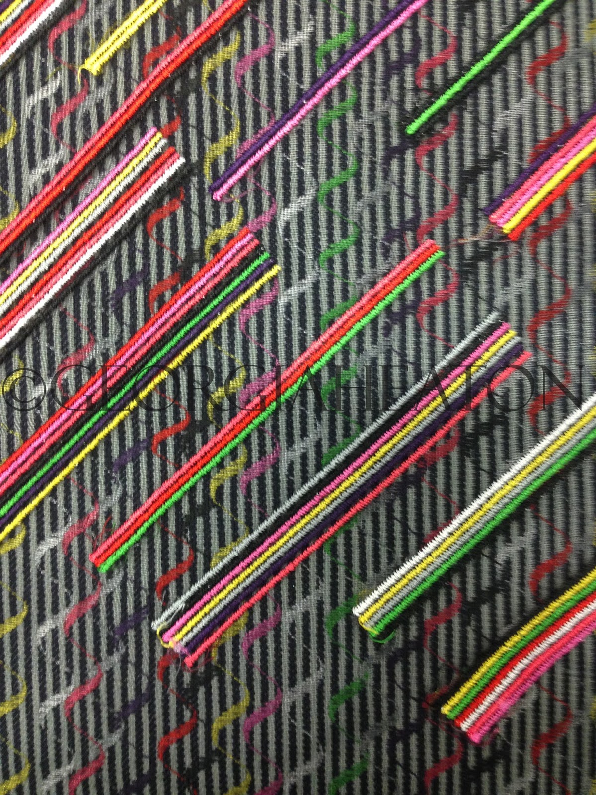
Contexts to explore were fashion and interiors; mainly focusing on Menswear and Suiting, aiming at high end designers, such as; Paul Smith, Saville Row and Hawes and Curtis. Sophistication is created through the restriction of only eight colours and the repetitive element of simple designs found within the stripes. My samples aim towards outerwear, suiting, fabric linings etc.

SELF INITIATED & CONTEXT
Aspiring towards a project where context isn't an issue was what I wanted to aim towards for my self initiated brief. Wanting to develop a body of samples alongside my Michael Kidner brief that would fit a varied context as a product of sample choices, whilst using various artist influences. Developing on my sketchbook work around inspiration of Paul Smith and translating this into fabrics and illusions was enjoyable as it meant my samples entailed a more playful element.

With my self initiated brief evolving from Michael Kidner, I kept the colour palette the same. But with new artist influences, such as; Paul Smith, Margo Selby and Josef Albers, I took away the specific colour structure and instead mixed the colours in a random order to enable more movement of the eye across the fabric sample.
My self initiated brief also included fabric exploration, choosing various surfaces to embellish. This included woven, upholstery, fashion and sheer fabrics. Using the same technique on the ETHOS software to repeat and develop samples on a larger scale. This enticed me into exploring a context where I make the fabric to sell elsewhere for another fashion/interior designer to construct a product with.
 |
| Experimenting with Striped Denim and Colour. |
Tuesday, 12 January 2016
TUTORIAL & EXPLORATIONS
After discussing my Michael Kidner work in my tutorial, it was decided to carry on progessing with samples and using my self initated project to develop my work and experiment with techniques to push contextual boundaries.
Using Paul Smith as a contextual influence as his designs are manipulated into many different products, from cars, to bottled water. The versatility in the stripe designs allows his work to appeal to a wider audience. Some of his designs feature quite natural colours, greys and browns - this helps to calm down the colour in his work for a less intense effect.

Continuing with the use of stripes in my own samples, I will further experiment with weights of thread onto printed bases. Using Ombre threads to create a hand-made persona, and exploring set stitches on the Pfaff machine to quickly stitch a simple pattern. Again experimenting with materials, I will use lightweight and heavy weight fabrics to viualise context, changing the texture and thickness of threads to experiment with the optical effect.

Also experimenting with the scale of my own stitches on the Ethos Software, ever changing the composition to sitch a textural fabric with an all over embroidered pattern, that depending on the material choice, could become double sided.
Using Paul Smith as a contextual influence as his designs are manipulated into many different products, from cars, to bottled water. The versatility in the stripe designs allows his work to appeal to a wider audience. Some of his designs feature quite natural colours, greys and browns - this helps to calm down the colour in his work for a less intense effect.
 |
| Paul Smith - Original Stripe Design (Material) |

Continuing with the use of stripes in my own samples, I will further experiment with weights of thread onto printed bases. Using Ombre threads to create a hand-made persona, and exploring set stitches on the Pfaff machine to quickly stitch a simple pattern. Again experimenting with materials, I will use lightweight and heavy weight fabrics to viualise context, changing the texture and thickness of threads to experiment with the optical effect.

Also experimenting with the scale of my own stitches on the Ethos Software, ever changing the composition to sitch a textural fabric with an all over embroidered pattern, that depending on the material choice, could become double sided.
Thursday, 10 December 2015
PRESENTATION FEEDBACK & VISUALISATIONS
Gathering feedback from my presentation, I
decided to aim for a product to sample towards within interiors. For me
this was a bespoke armchair. Creating initial design ideas helped to
progess with placement of embroidery and the depth of layering, choosing
sterdy materials like cotton canvas as an upholstery material.


Artists such as Collier Campbell were suggested for me to explore as my own work is similar and could help towards reviving the Campbell company. I also explored the work of Jennifer Taylor, her interior furniture designs are classical and contemporary all at the same time, aspiring to this I created my own designs combining the market research I found and the high end quality that I aspire to.

It was also suggested to keep the simple stripes and checks as a base pattern, using embroidery to add the detail and texture. The experimentation would be within the scale, composition and choice of machine and stitch. I further want to explore layering my embroidery designs more, creating a sample that is more dense in some places than others.
I have also this week experimented with weight of material, using a 'Cotton Organza', to help me visulaise a double sided sample, due to the transparency of the fabric - this also opened my eyes into fashion fabrics.

Thursday, 3 December 2015
DEVELOPMENTS
Further developing drawings into collages and repeat prints, explored a varied surface for me to work with, and processing these prints into digital fabric and experimenting with transfer printing successfully enabled me to produce optical illusions when embroidered ontop of.

Producing illusional drawings from gouache and acetate to allow layering helped to develop my ideas into stitch techniques. A restrictive colour palette of eight colours entailed using technique and skills to create a more versitile reponse to optical illusions meaning the restriction of colour made the chance of illusion higher.
 Inspiration for all of this came from Wallace & Sewell and Japanese Op Art.
Wallace & Sewell design woven poducts, for interiors and fashion, using their construct techniques as inspiration to produce my drawings and adding the stitch to enable my fabric to connote woven materials.
Japanese Optical Art inspired the circles and how to fill them with stitch, using spirals with a varied stitch length and changing the direction of the stitch fill, using a shiny madeira thread enhanced the illusions.
My samples are mainly being produced on the ETHOS software as it easily translates my ideas into optical illusions. Creating my own stitches on the software allowed me to reduce and enlarge; the pitch size, the 'packing' stitch, composition, scale and layering. This software has allowed me to produce effective samples quickly as ideas can easily be manipulated.


Producing illusional drawings from gouache and acetate to allow layering helped to develop my ideas into stitch techniques. A restrictive colour palette of eight colours entailed using technique and skills to create a more versitile reponse to optical illusions meaning the restriction of colour made the chance of illusion higher.

Wallace & Sewell design woven poducts, for interiors and fashion, using their construct techniques as inspiration to produce my drawings and adding the stitch to enable my fabric to connote woven materials.
Japanese Optical Art inspired the circles and how to fill them with stitch, using spirals with a varied stitch length and changing the direction of the stitch fill, using a shiny madeira thread enhanced the illusions.
My samples are mainly being produced on the ETHOS software as it easily translates my ideas into optical illusions. Creating my own stitches on the software allowed me to reduce and enlarge; the pitch size, the 'packing' stitch, composition, scale and layering. This software has allowed me to produce effective samples quickly as ideas can easily be manipulated.

Thursday, 26 November 2015
SAMPLES
With the aim of working towards three collections of samples that make up one final collection, I decided to explore Spots, Stripes and Checks. Investigating into how composition determines the effectiveness of the sample, and how to combine the correct patterns.

Combining the patterns (eg, spots with stripes) was successful as the designs became more intricate and planned.


Carefully planning the placement of the spots on top of the print, by aligning the colours - was even more effective as the optical effect was greater and allowed the spots to dance on top of the print. Therefore the movement and structure of the print onto the surface was successful in keeping with my main influence of Michael Kidner, using space as a constant movement.

Using Japanese Optical art as an influence helped to progress my initial thoughts and push the boundaries even further by thinking outside the box, inspiring me to challenge myself in creating something similar with colours. Aiming to create stitches on the Ethos sewing machine that are similar to those of Japanese Optical art will be a challenge, however the restrictions of the machine should enable a more effective and repetitive outcome.
 |
| Experimenting making my own stitches on ETHOS software. |
Thursday, 19 November 2015
COLOUR EXPLORATION
Colour explorations through my sketchbook became textural and pattern based, painting onto transparent surfaces allowed my drawings to be layered, creating movement in my drawings, emphasising optical effects. The layering of transparent drawings allowed for various end outcomes, exploring with different compositions and placements to decide the most effective outcome.

Exploring my colour palette through yarn wrappings and mixing colour was interesting to see, as my wrappings developed into something more complex. Choosing the most vibrant, contrasting colours from my palette and layering horizontally and vertically across each other created a new surface, almost like a weave, which was interesting to see as I started to gather ideas for samples, and in a way the wrappings are my samples.
Postponing sampling due to further research and inspiration, as I felt that my colour palette needed to become more contemporary and colourful. Keeping my concept and allowing my work to stay personal, I decided to record my journey commuting to uni everyday. This included graffiti; often being ignored, and unappreciated, graffiti is never seen as beautiful, however, it transforms a surface from dull, and boring into a piece of art.
Processing my new colour palette as I did with the last one to create intricate striped digital drawings, created something more similar to that of Michael Kidner's work. Taking inspiration from his technique of structure first and colour second, I have developed my own drawing technique/process.
These are successful drawings as they become optical, creating something beautiful with movement. I want to further add to this optical effect with the use of stitch onto digitally printed drawings, carefully selecting materials to embellish onto.

Exploring my colour palette through yarn wrappings and mixing colour was interesting to see, as my wrappings developed into something more complex. Choosing the most vibrant, contrasting colours from my palette and layering horizontally and vertically across each other created a new surface, almost like a weave, which was interesting to see as I started to gather ideas for samples, and in a way the wrappings are my samples.
 |
| Yarn Wrapping, mixing contrasting colours. |
Postponing sampling due to further research and inspiration, as I felt that my colour palette needed to become more contemporary and colourful. Keeping my concept and allowing my work to stay personal, I decided to record my journey commuting to uni everyday. This included graffiti; often being ignored, and unappreciated, graffiti is never seen as beautiful, however, it transforms a surface from dull, and boring into a piece of art.
Processing my new colour palette as I did with the last one to create intricate striped digital drawings, created something more similar to that of Michael Kidner's work. Taking inspiration from his technique of structure first and colour second, I have developed my own drawing technique/process.
These are successful drawings as they become optical, creating something beautiful with movement. I want to further add to this optical effect with the use of stitch onto digitally printed drawings, carefully selecting materials to embellish onto.
 |
| Michael Kidner (left) | Own Photograph (centre) | Own Digital Drawing (right) |
Monday, 2 November 2015
DRAWING DEVELOPMENT
Due to the research that I have already produced into my practice work, I feel that the Michael Kidner brief best fits my aspirations as a live project.
Kidner uses the concept that "Space is a constant movement", keeping with the ideal of beauty and how it can be translated through movement and the use of stitch I want to further explore how colour combinations and an optical effect can be created by colour choice and placement.
Strips is a series by Gerhard Richter, examining his previous paintings and condensing them into stripes. I processed my yarn wrappings in a similar way on Illustrator to create an optical effect. Effectively these drawings could be digitally printed and further embroidered into using domestic techniques to optify.

Subscribe to:
Posts (Atom)