Sunday, 6 March 2016

LONDON OVERVIEW

Visiting the Flowers East Gallery provided a strong visual of the exhibiton space, allowing me to understand the maximum scale that I should work to.
I could sense that my originally pitched idea would rapidly develop into something more suitable for the gallery space and in fitting with the other students work.
Deciding on sets of canvases all the same length but different in width, with stretched samples over to be refelctive of my refined and restrictive striped samples; was more fitting with the gallery and accepted all round by the Kidner family.

The Tate archive of Kidner's work was interesting due to the intensity of colour and breadth of medium used - similar to that of my own. My future intentions are to produce a sketchbook that develops the relationships of colour through pattern; working with coloured embroidery onto a greyscale neutral ground.

Kidner's sketches.

Collating fabric swatches from Berwick Street material shops, allowed me to visualise how various compositions and pairings of fabrics sit with each other. Understanding the effectiveness of my canvases without stitch. 


Friday, 19 February 2016

DEVELOPMENTS & IDEAS

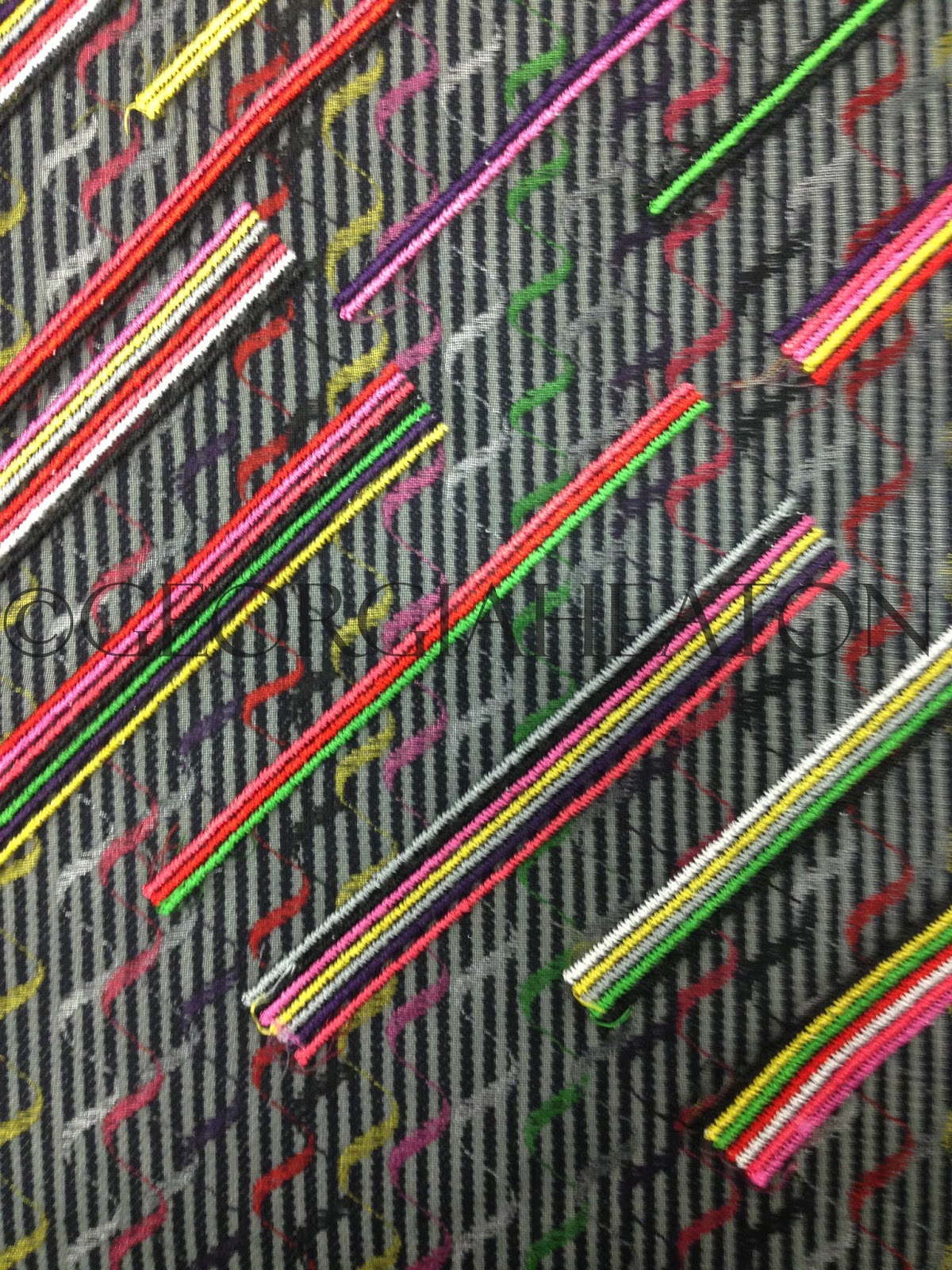
Producing samples on the Pfaff machine before the start of Unit X, progressed my ideas into something tangible. Applying structures from my yarn wrappings into an all over embroidered  pattern onto various weights of fabric was effective through pigment of colour and the translation from drawings into stitch.

Colour Changing thread onto Striped Denim

Translation of Yarn Wrapping onto Wool Flannel

Preparing an effective collection of samples displaying the development of my work for the Michael Kidner pitch was interesting due to the visual developments from start to finish through drawings and samples; relating to the underlying concept of my research.
The overall reaction of the Kidner family was successful and motivating. Their feedback was crucial to the development of my work and their ideas and relationship to Michael's work was beneficial.
Review - After being chosen to complete a piece of work for the Flowers East Gallery reflective of Michael Kidner, I decided upon double-sided samples for an un-resolved context. This was to be discussed at the next meeting with the family in London after reviewing the gallery space.

Saturday, 6 February 2016

FINAL EVALUATION

Throughout this unit I have thoroughly challenged myself exploring processes and building upon new skills to effectively construct samples towards a successful final outcome.  Developing my own structure to working and producing varied outcomes through the restrictions within my research enabled me to find a process in which I work best. Firstly this included sampling and then later visualisations and designs of samples through drawings, becoming inspired by my own work.

Starting the Practice unit with inspiration from my Summer project and influences from my placement at Cabbages & Nettles I was aiming towards a body of work that concentrated on surface embroidery, using stitch techniques to materialise layering of thread through the use of a domestic Bernina.
Initially researching tree bark with the concept of 'un-appreciated beauty' meant my colour palette wasn't very clean and contemporary.

Searching for new research I became inspired by Michael Kidner and the colourful compositions within his work. This further inspired me to participate in the live brief for this unit. Resulting in a heavy influence on my self-initiated project, simultaneously producing work for both project briefs enhanced the creativeness of effective samples.

Researching graffiti as ‘ugliness’ I extracted colours and refined a limited colour palette, processing this through structural designs inspired by Michael Kidner. The result of this was a restricted colour palette focusing on Optical art and embellishment to create fabrics for a varied target audience and a multiple of contexts.

Using the multihead (ETHOS) machine to explore a more digitally based development of sampling was effective, as I had to plan in advance the outcomes of each week. Experimenting with this machine changed my initial approach to this unit, celebrating an all over pattern onto an array of surfaces. With a limit of twelve colours on this machine I explored colour and grayscale, carefully constructing an order to colour and shape.

Using set stitches on the Pfaff machine also enabled a structure to embellishment design on different surfaces as the repeat was exact, increasing the effectiveness of optical conclusions.

This unit allowed me to understand that limitations allow a wider more diverse breadth of outcomes and successful creativity within embroidery.

Mainly aiming within this unit to produce a body of work to fit all contexts was harder than refining my context. However after researching designers such as; Margo Selby, Wallace & Sewell and Paul Smith I enjoyed the idea of creating a repeat embellished design on various materials to create on large fabric to be sold by the metre to existing companies for use within a fashion and interior context.

Continuing with restrictions through colours and techniques, I will further limit myself in the next unit to persist with the same body of work, developing and finding new research to produce samples as effective for the degree show through the use of embellishments as a wider technique, refining contexts and realisation of audiences.

Thursday, 4 February 2016

GRAYSCALE

 Utilising sketchbook work to trial colour proportions before commiting to making a fabric was experimental and restrictive using only a grey palette.
As well as constructing yarn wrappings with an ombre effect, I tested what  it would be like to use thin stips of various sample fabrics. The edges created with the material allows the colours to mingle and the added ombre thread is effective on the darker coloured background.

The effectiveness of this inspired me to translate my sketchbook work onto fabric, using spirals onto a polyester chiffon processed through the ETHOS machine. The opacity of the material allowed layering onto various backgrounds creating depth and movement. Although the design was well structured and carefully planned the layering enabled a delicacy.


Changing the pitch of the stitches and composition and scale of design was supposed to create a checked effect using circles. However this wasn't as effective on the chiffon material as it became rigid and awkward. Therefore I decided to cut the seperate suares and stitch them back to another chiffon loosely, creating 'sequins'. This allowed the fluidity and movement to re-evolve. I would like to further experiment with this using various background material, designs, colour and shapes - this would allow me to use my embellishments as a collage similar to that in my sketchbook, whilst aiming further towards a fashion context.


Monday, 1 February 2016

COLOUR VS GRAYSCALE

After intensley exploring colour variations, I decided to restrict myself by using grayscale, incuding; black, white, grey and ombre threads to variate the outcomes and effectiveness of the structures and compositions behind the embellishment within my samples.


Colour Vs Grayscale design

The repetitive structures inspired me to explore my yarn wrappings as a sample, using Margo Selby as an inspiration. She often uses ombre wrappings to make her warp, and a process called 'Strie' a term used where colours come in groups of three and alternate to create a graduated stitched effect. Below is this technique created using colour and grayscale to visualise the contrasts and differences with the restrictive colour palettes.
Margo Selby Inspiration | Strie Compositions
Gradually introducing grayscale and neutral colours into my palette enhanced the successfulness of my samples, as the structure was thoroughly planned before stitching out.


Trying to replicate the structures within my yarn wrappings onto Menswear, Suiting fabrics, layering the coloured stitches through the ETHOS software and roatating to create a checked design. The composition is successful as the open pitch on the stitching allows the colours to bleed.

Friday, 29 January 2016

REVERSIBLE SAMPLES

Creating samples with a woven effect whilst using the ETHOS software and the Pfaff machine was easy as by changing the tension on the top thread and keeping the bobbin thread the same colour throughout the sample, allowed a speck of top colour to seep through underneath stitching optically on both sides.

ETHOS Embroidery onto Denim stripe | Back

ETHOS Embroidery onto Denim stripe | Front
 Exploring the ETHOS machine to widen my technical skills was successful as during this unit I have been signed off on the machine. This was a result of enlarging the scale of my design. The sample above is created by a block of eight by eight circles (obi stitch, pitch 0.75), and stitched onto a coated striped denim fabric. It was stitched out in the larger sash frame - this meant that for the scale of fabric that I was stitching on it had to be precisely measured centrally to created a layered optical effect without flaws.


Wednesday, 20 January 2016

DEVELOPING SAMPLES FROM MICHAEL KIDNER

Using the same ETHOS design and repeating randomly, changing the colours to experiment with composition. Stitching onto different fabrics, e.g. polyester chiffon, that can be layered over other samples to create more depth and patterns.
Instead of creating lots of different designs I wanted to explore the potential of using the machine to push the boundaries and create patterns. I flipped the designs, and rotated them matching them up on the striped denim and also purposefully stitching offset (the latter was more difficult).

Bmp. of ETHOS design.

Layering samples was effective and helped with inspiration towards to progression of further sampling ideas. Through layering samples I created a more diverse collection successfully aiming towards many contextual outcomes, layering also helped towards creating a woven fabic effect through embellishment.

Contexts to explore were fashion and interiors; mainly focusing on Menswear and Suiting, aiming at high end designers, such as; Paul Smith, Saville Row and Hawes and Curtis. Sophistication is created through the restriction of only eight colours and the repetitive element of simple designs found within the stripes. My samples aim towards outerwear, suiting, fabric linings etc.